Checkout Design Festool
Client: Festool GmbH
A Project by: Maria Barbulovic
2025
UX Design
Ui Design
E-Com
Work in progress
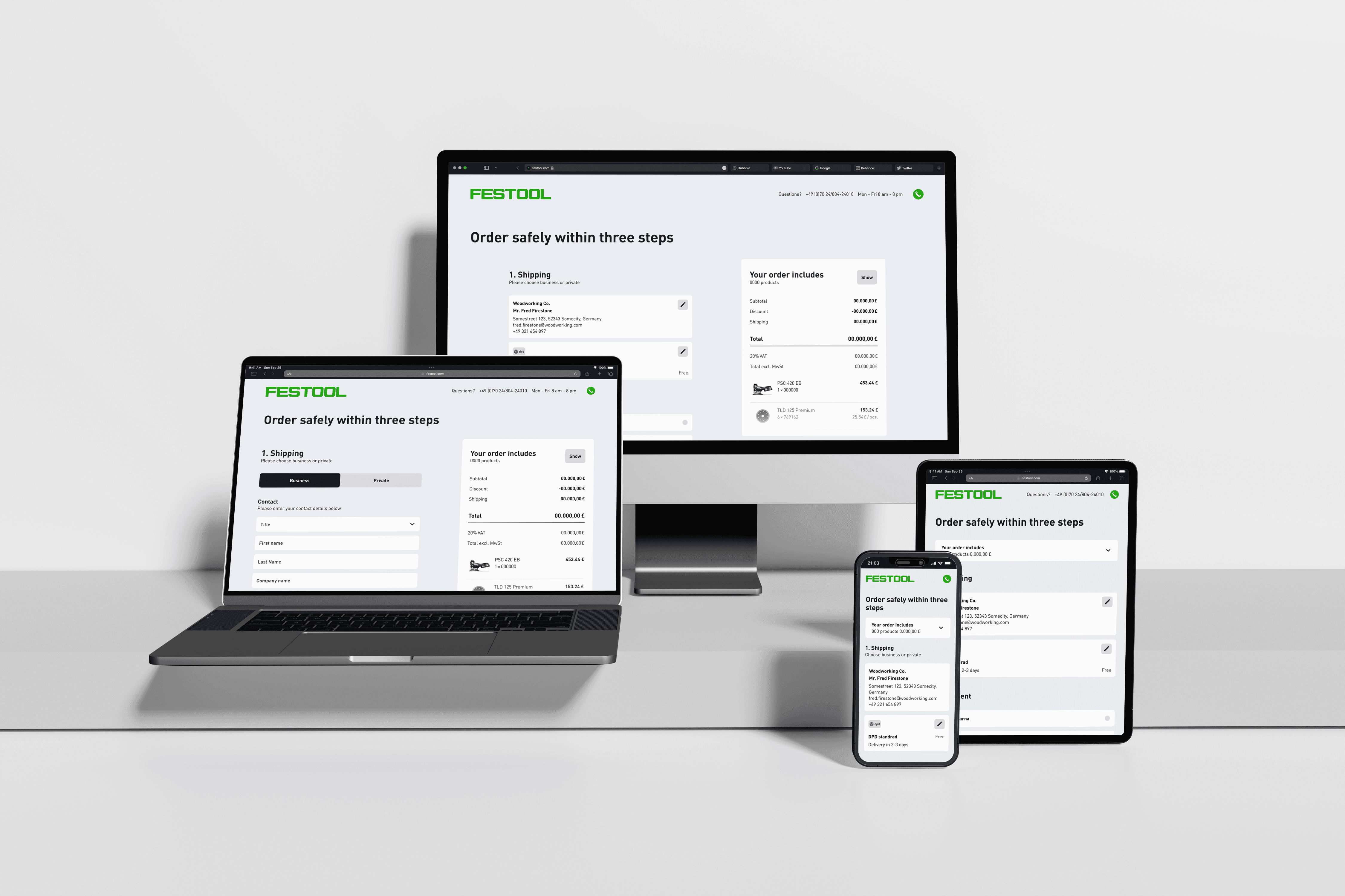
For Festool, a premium manufacturer known for its high-quality power tools for professionals and industry, I designed the checkout process for their new online shop. The goal was to create a seamless, intuitive, and user-friendly experience that reflects the brand’s high standards. The design was developed in alignment with Festool’s recent redesign and the newly established design library, ensuring a cohesive and consistent user experience. With a clean UI, reduced complexity, and optimized user flow, the checkout enables a smooth purchasing process for both professionals and new customers alike.
User flow
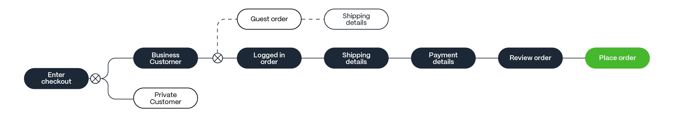
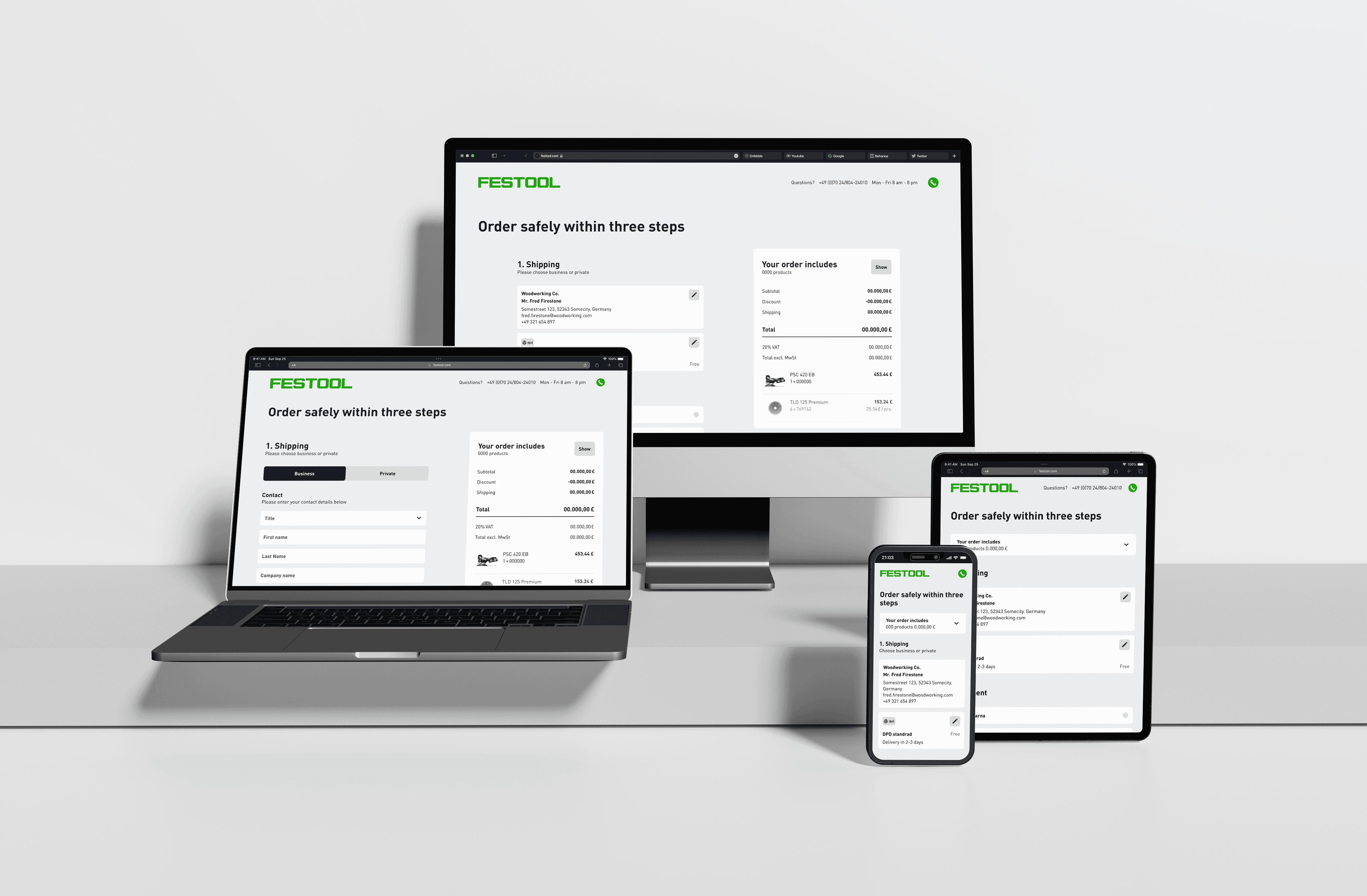
The checkout flow for the new Festool online shop was designed for a seamless and intuitive experience. Customers are guided through clearly structured steps, distinguishing between private and business buyers as well as registered users and guest checkouts.
By reducing complexity and integrating the new design library, the process remains efficient. Special focus was placed on error prevention and a consistent brand experience, ensuring a smooth purchase journey for both professionals and new customers.
Interactions
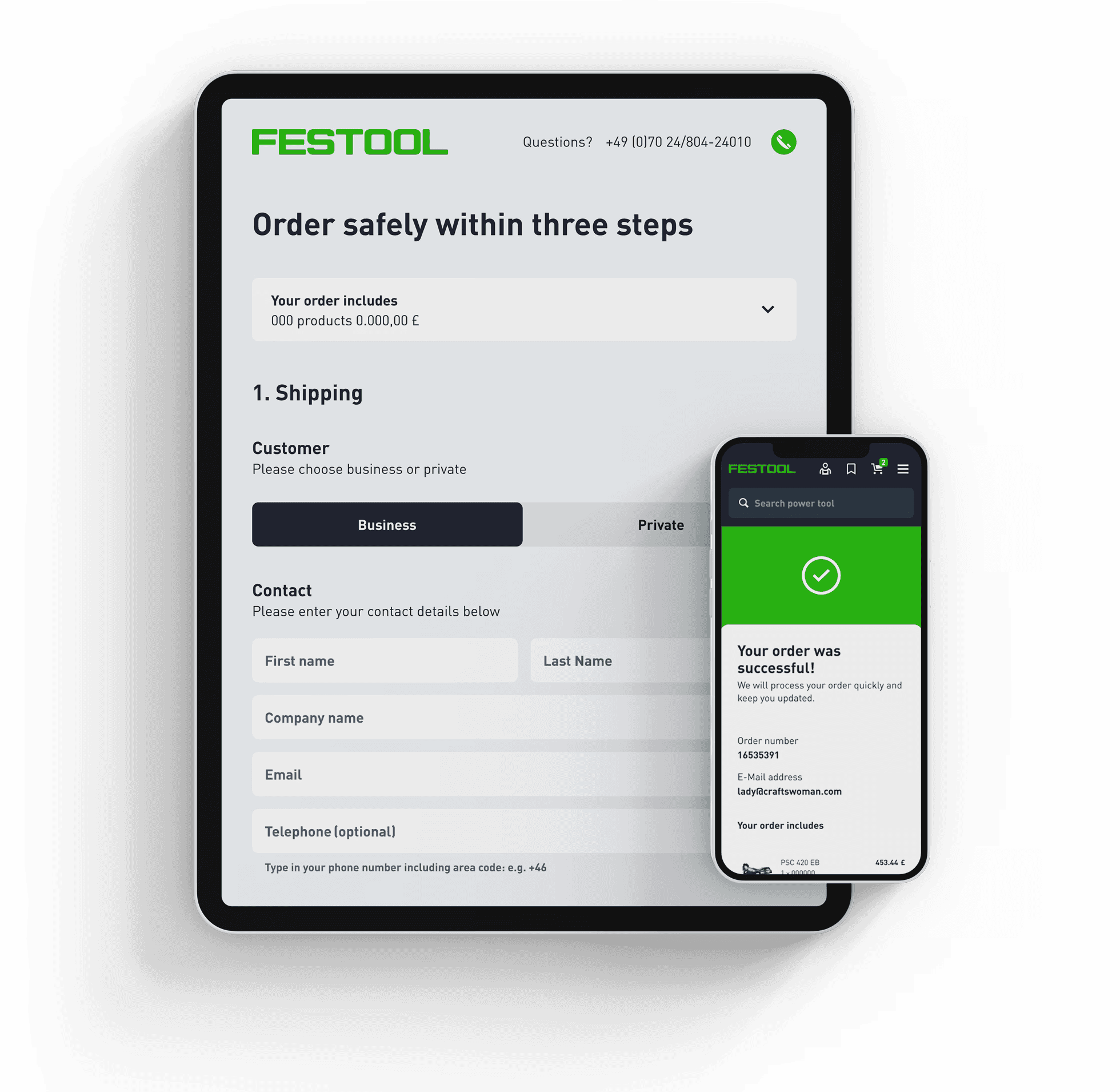
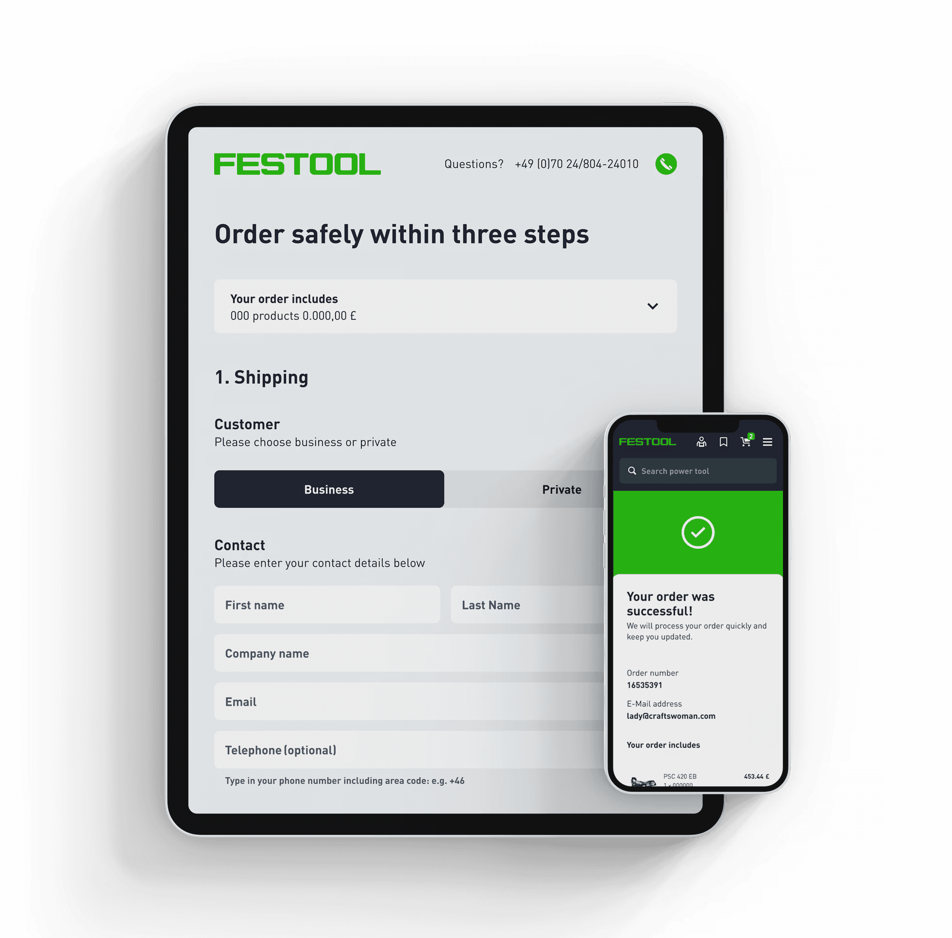
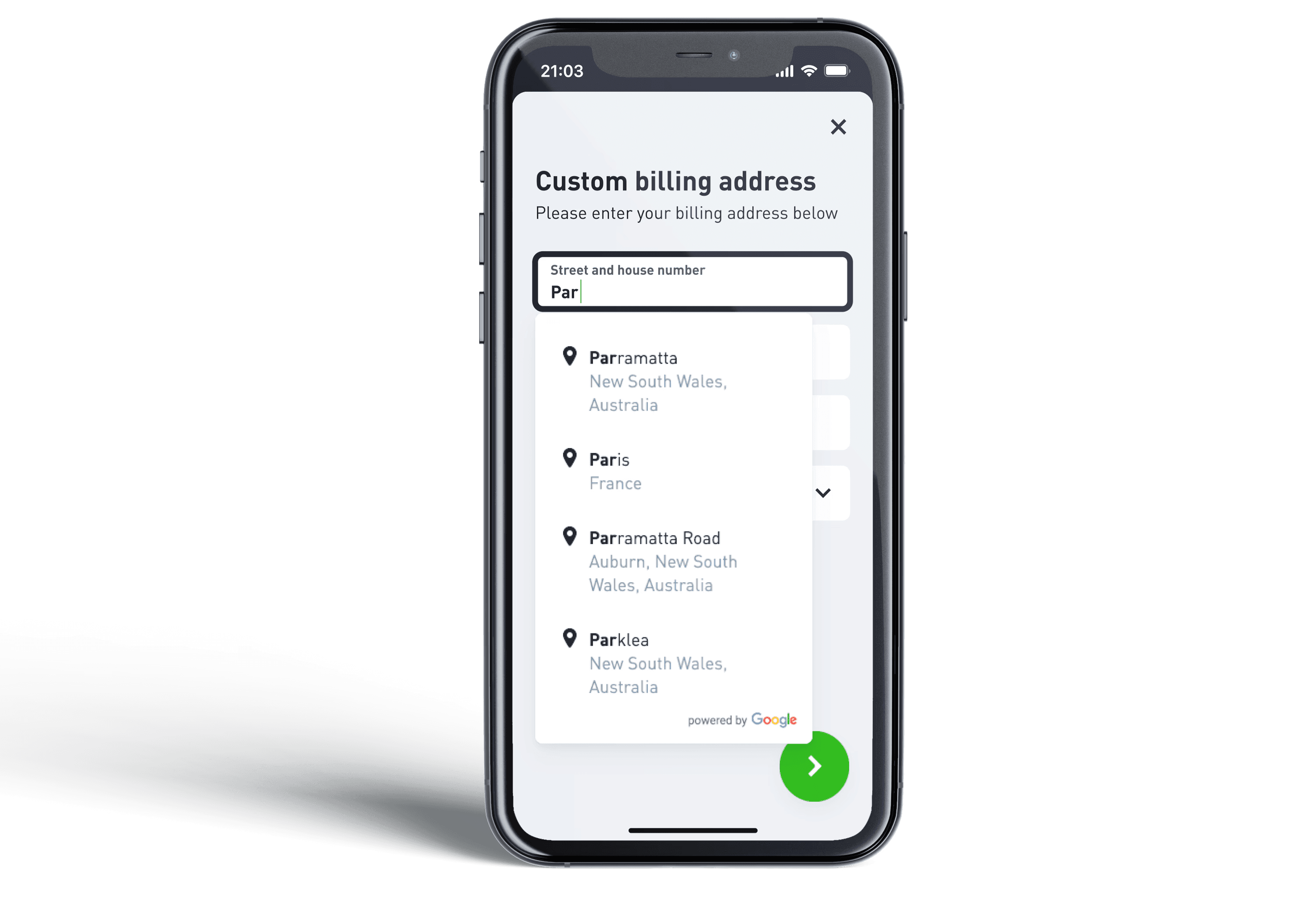
Through previous A/B-tests and qualitative data research we found out that our users used to struggle with the old address form. They didn't seem to understand the error messages (that mostly came because of the browser's the auto-fill function) and the validation process was not transparent enough.
Therefore, we included a Google address validation and customised the error messages. This way, our customers can pick the correct address and fill the input fields accordingly, so our system is able to process them.

To make the walk-through as simple as possible, we implemented three steps: Shipping, Payment and Order Review. While filling out the first part of the form, the next steps are collapsed. They only expand once they get relevant, so the user can focus on what's relevant for the current step without getting unnecessarily distracted.
The user can return to editing the previous steps anytime by using the "edit"-button on each card after it was filled out.
This makes the page size less overwhelming and reduces the page load time. It also will be easier to implement the design with regards to the upcoming headless CMS.

Solar Constellations
Checkout Design Festool
Checkout Design Festool
Client: Angella Mackey
A project by Chantal deiß, karim marei, hugo plazas & Maria Barbulovic
Client: Festool GmbH
A Project by: Maria Barbulovic
Client: Festool GmbH
A Project by: Maria Barbulovic
2023/24
2025
2023/24
Concepting
UX Design
Concepting
UI Design
UI Design
UI Design
Accessibility
UI Design
Accessibility
Concepting
Accessibility
2023/24
3D Printing & Prototyping
Concepting
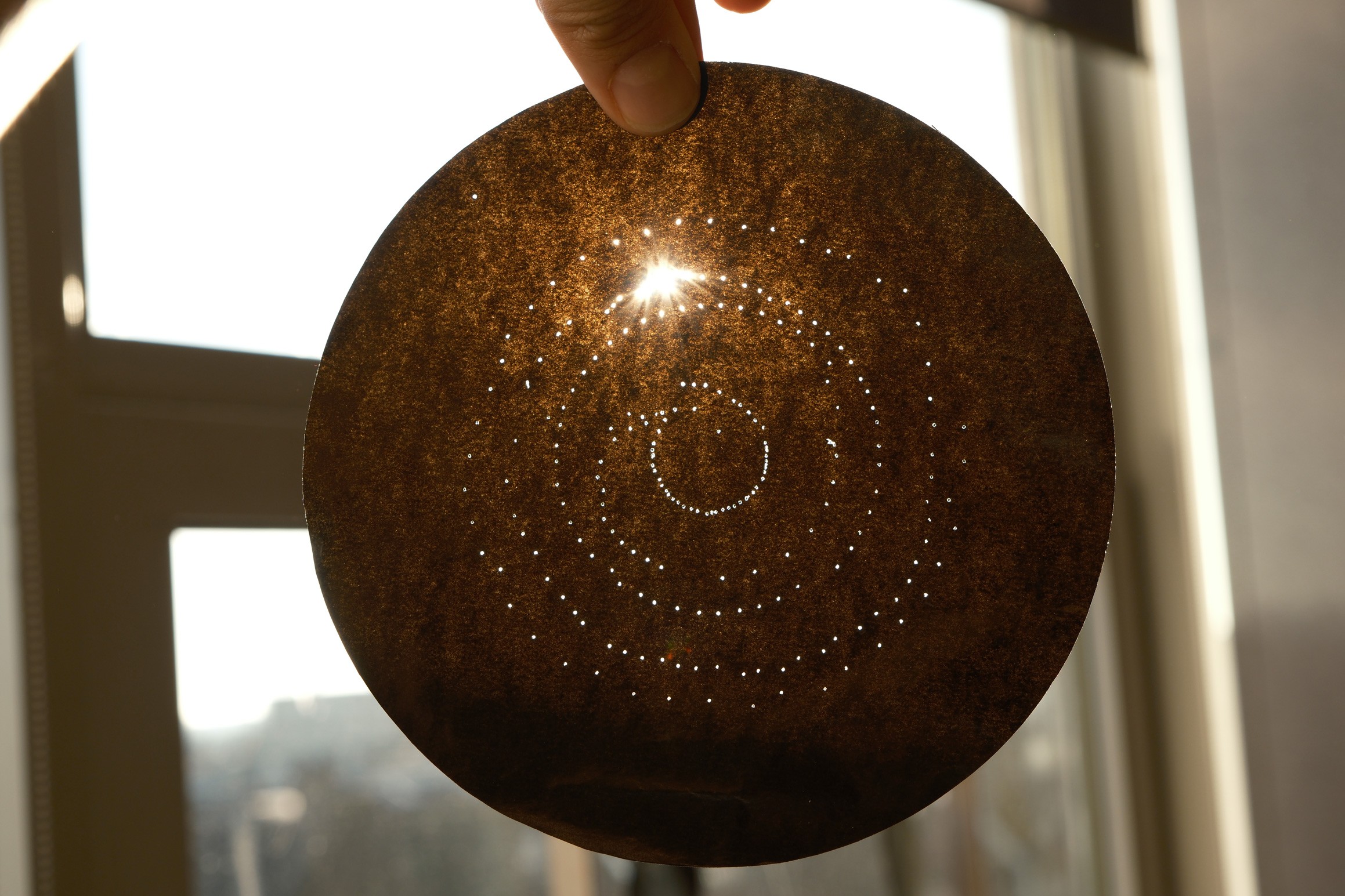
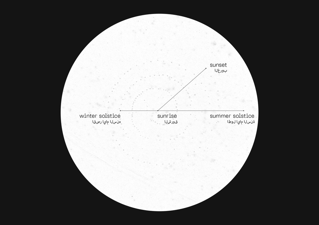
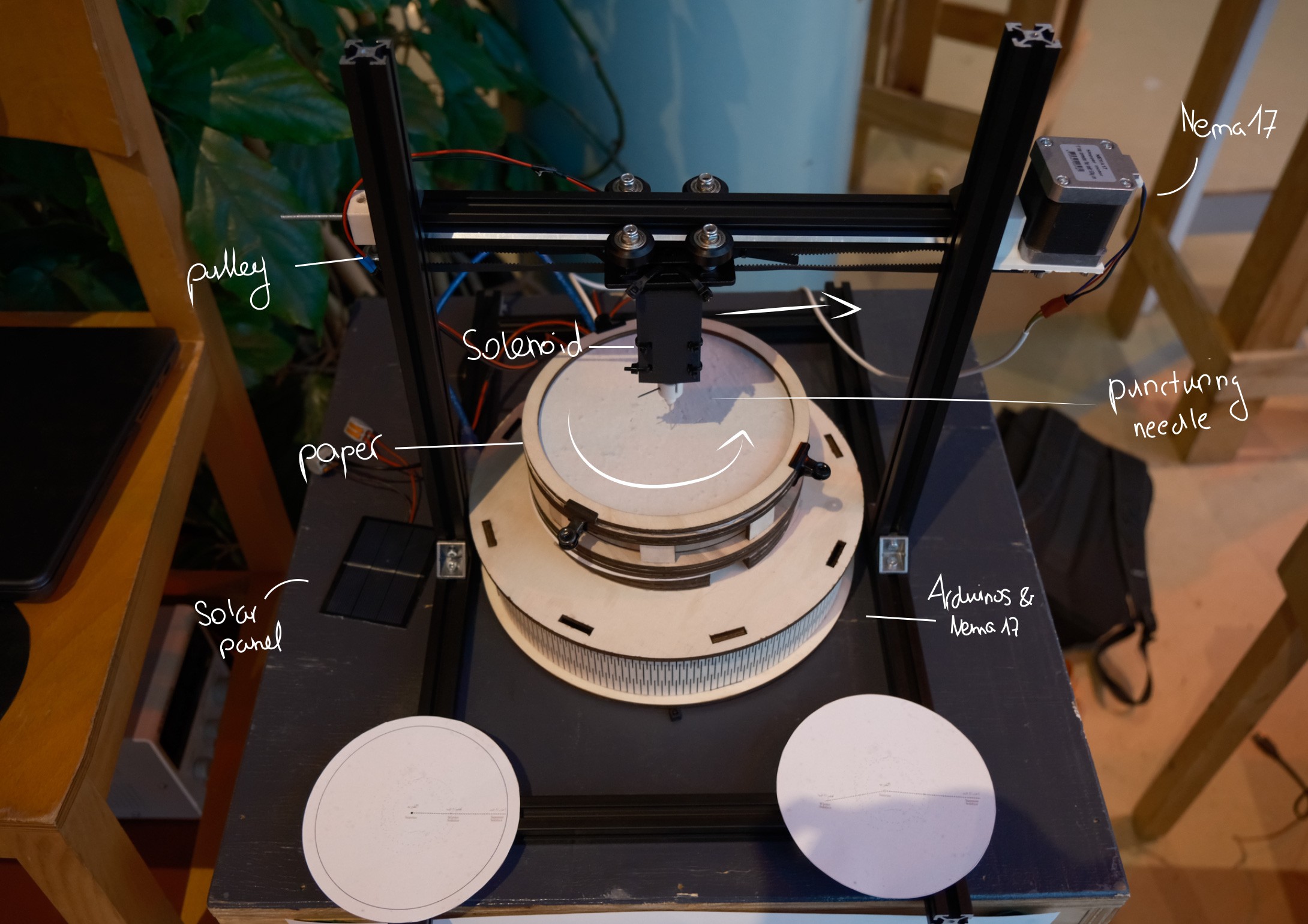
Solar Constellation is a project that was created within the context of bringing a new understanding to solar energy, based on our client's research in that field. It is shifting from a human-centred perspective to a more-than-human approach, making the Sun its centre of interaction. Our intention was to give the Sun the ability to create artefacts that are reflecting its intensity of energy throughout the day. The installation functions almost like a sewing machine, puncturing holes into round paper. The frequency of the puncturing movement varies with the intensity of sunlight. it starts with sunrise and ends with sunset.
Solar Constellation is a project that was created within the context of bringing a new understanding to solar energy, based on our client's research in that field. It is shifting from a human-centred perspective to a more-than-human approach, making the Sun its centre of interaction. Our intention was to give the Sun the ability to create artefacts that are reflecting its intensity of energy throughout the day. The installation functions almost like a sewing machine, puncturing holes into round paper. The frequency of the puncturing movement varies with the intensity of sunlight. it starts with sunrise and ends with sunset.
Solar Constellation is a project that was created within the context of bringing a new understanding to solar energy, based on our client's research in that field. It is shifting from a human-centred perspective to a more-than-human approach, making the Sun its centre of interaction. Our intention was to give the Sun the ability to create artefacts that are reflecting its intensity of energy throughout the day. The installation functions almost like a sewing machine, puncturing holes into round paper. The frequency of the puncturing movement varies with the intensity of sunlight. it starts with sunrise and ends with sunset.

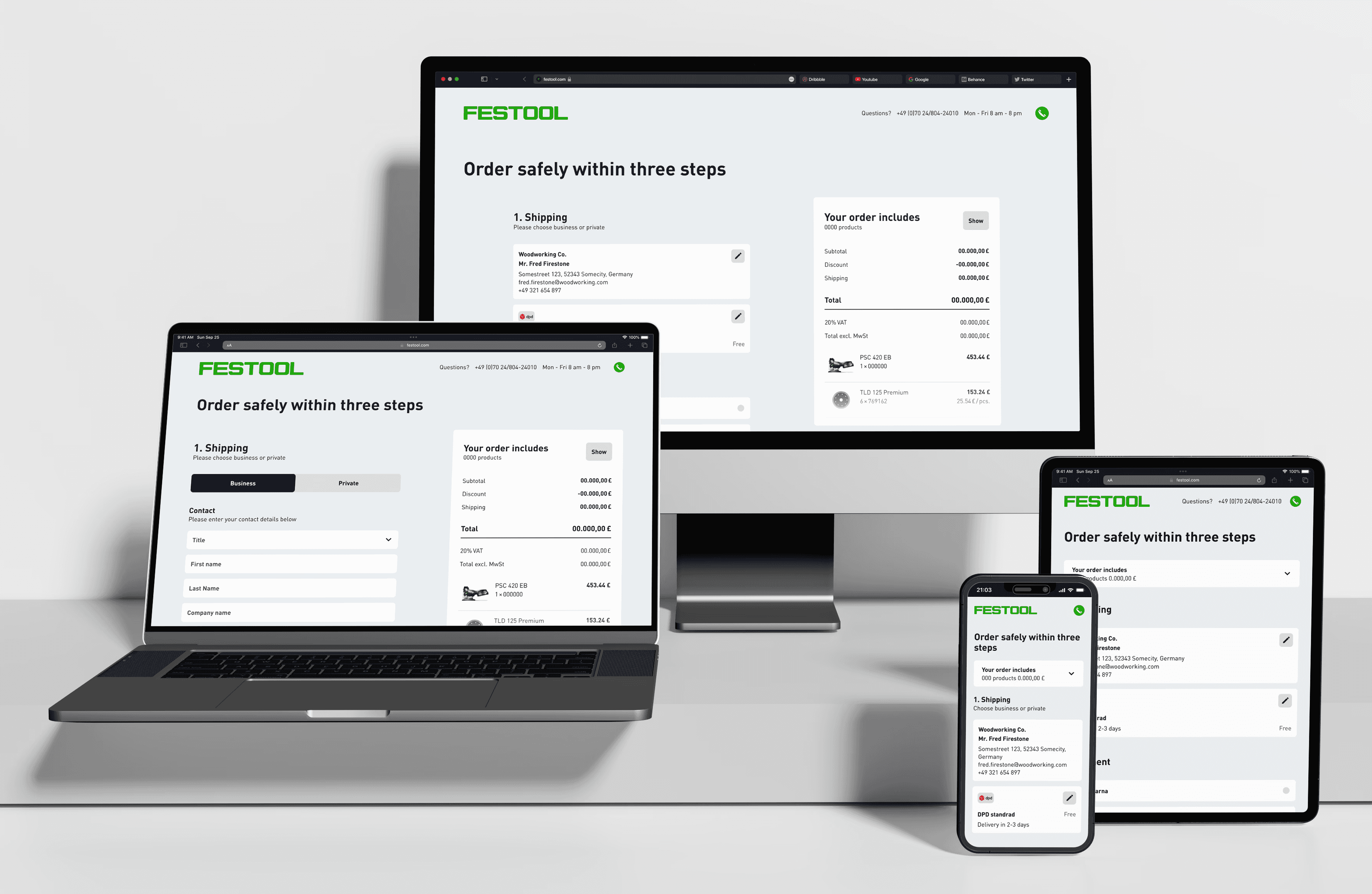
User flow
The checkout flow for the new Festool online shop was designed for a seamless and intuitive experience. Customers are guided through clearly structured steps, distinguishing between private and business buyers as well as registered users and guest checkouts.
By reducing complexity and integrating the new design library, the process remains efficient. Special focus was placed on error prevention and a consistent brand experience, ensuring a smooth purchase journey for both professionals and new customers.
Interactions
Through previous A/B-tests and qualitative data research we found out that our users used to struggle with the old address form. They didn't seem to understand the error messages (that mostly came because of the browser's the auto-fill function) and the validation process was not transparent enough.
Therefore, we included a Google address validation and customised the error messages. This way, our customers can pick the correct address and fill the input fields accordingly, so our system is able to process them.
To make the walk-through as simple as possible, we implemented three steps: Shipping, Payment and Order Review. While filling out the first part of the form, the next steps are collapsed. They only expand once they get relevant, so the user can focus on what's relevant for the current step without getting unnecessarily distracted.
The user can return to editing the previous steps anytime by using the "edit"-button on each card after it was filled out.
This makes the page size less overwhelming and reduces the page load time. It also will be easier to implement the design with regards to the upcoming headless CMS.